From Painted Signs to the Modern Pictogram
See how painted signs became modern pictograms, and learn how context, labels, and placement help people read a symbol without guessing.
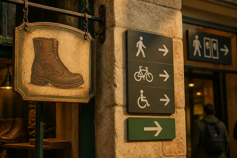
A painted boot above a shop door gives a passerby a clue before they read a word. The same boot on a trail marker could suggest a walking route, while in a museum it might identify an exhibit. The history of painted signs and modern pictograms is not a simple move from pictures to universal symbols. It is a changing relationship between an image, the place where it appears, and the conventions its viewers know.
Painted signs borrowed meaning from their surroundings
Imagine a painted tool hanging outside a workshop. The doorway, the work visible inside, and the objects nearby all help explain the image. A painted cup over an inn could point toward food or hospitality because of the business it marked. Taken away from that setting, either picture could become harder to interpret.
Materials shaped the choices an artist could make. A sign painted on wood or plaster had to remain visible from the street, so a distinct outline or recognizable feature could matter more than fine shading. A handle might help identify a cup; a boot’s shape might do more work than the texture of its leather.
These signs did not form one shared code. Regular customers might recognize a local image that puzzled visitors. Even a familiar object could suggest different things in different trades or communities. A picture could offer a useful clue, but viewers still relied on context.
Public signs had to guide people through unfamiliar places
A shop sign points to a particular business. A sign in a station, civic building, or large workplace may need to help a stranger find an exit, platform, or service. That is a different task: the viewer may be moving, scanning several signs, and deciding which way to go.
In such a setting, a symbol has to stand out from nearby information and connect clearly to a destination or action. A simple outline can help a viewer recognize the subject, but the image alone may not explain what to do. An arrow can turn an identifying symbol into a directional cue, and a label can clarify what the symbol represents.
Signs can also work in sequence. An arrow at a junction points toward a route; a matching symbol farther along can confirm that the traveler is still headed toward the intended place. Here, placement carries part of the message. A picture identifies something, while its position and neighboring cues can guide a decision.
Standardized symbols can be reproduced across locations, but standardization does not make every symbol self-explanatory. A person may recognize the depicted object yet not know the local convention attached to it. A consistent visual system helps people connect related signs, while a short label can bridge gaps in familiarity.
A pictogram keeps only the details that help recognition
A pictogram is a simplified image used to represent an object, action, category, or place. It differs from a decorative drawing because it is intended to communicate within a sign system. Its outline and details should help the viewer identify what matters in that setting.
A bicycle symbol might retain two wheels, a frame, and handlebars while leaving out spokes and surface texture. Those omitted details do not help much if the task is simply to locate bicycle parking. But if the image is meant to distinguish one kind of bicycle-related service from another, the designer may need a label or a more specific cue.
Recognizing an object is not the same as understanding an instruction. A person beside a doorway might indicate an entrance, a room, or an accessible route. An arrow, a word, or the sign’s position can narrow the possibilities. Without such cues, the viewer may recognize the figure but remain unsure what it means.
Say a visitor enters a community center and sees a person icon beside two doors. The starting point is an ambiguous symbol and no labels. The visitor reads the room names on the doors, then follows an arrow paired with the icon; the expected observable result is a clear match between the symbol and one destination. The tradeoff is that text and directional cues take space, but they can resolve uncertainty that a more detailed drawing might not.
Context and convention decide which meaning feels likely
People read images alongside nearby words, objects, and expectations. A symbol beside a restroom label is interpreted differently from the same symbol on a sports diagram. The setting helps determine which of several possible meanings is relevant.
Repeated exposure can make a convention familiar. A person may learn to read an arrow, a crossed-out image, or a facility symbol through encounters in public places. Someone who has not seen that convention may read the image literally or connect it to another idea. What seems obvious to a designer may not be obvious to a first-time visitor.
Experience and culture also affect interpretation. An object common in one place may be unfamiliar elsewhere, and a gesture may carry different associations across communities. The people and activities shown can influence who feels addressed by a sign and who understands its purpose.
For that reason, a pictogram works best as communication within a particular situation, not as a universal code. A short label, a consistent style, and placement near the point of decision can all clarify its meaning. The right combination depends on the audience and the task.
Why can the same pictogram mean different things?
Does a pictogram work without words?
It can, when the subject is familiar and the setting makes its purpose clear. If several interpretations are plausible, a brief label can help the viewer choose the intended one.
Why do designers simplify a picture?
Simplification keeps attention on the features that identify the subject. Fine details may distract from those features or disappear when the sign is viewed among other information.
Can one symbol work in every culture?
A symbol should not be assumed to mean the same thing to every audience. Familiar objects and conventions vary, so a label, local review, or different image may be needed.
When should a sign use a label as well?
A label helps when viewers may not recognize the image, when meanings overlap, or when a mistaken choice could cause confusion. Text and image can clarify different parts of the same message.
Use the whole sign system to judge a pictogram
A symbol in a busy public place shares attention with room names, maps, arrows, building features, and other signs. Related icons can look consistent in line weight and proportion, while distinct outlines help people tell them apart. The goal is not uniformity for its own sake; the symbols should be easy to connect without becoming indistinguishable.
Placement matters, too. A sign over a doorway can identify a room. The same sign at a junction can help someone choose a route before reaching it. If an icon appears in inconsistent locations, visitors may have to search for it just when they need to make a decision.
When assessing a pictogram, check the whole encounter and make a decision from each observation:
- Check whether the intended action or place is clear; if it is, keep the image focused on that task, but if not, add a label or a more specific cue.
- Check whether the intended audience is likely to recognize the pictured object or gesture; if yes, retain it, but if not, choose a more familiar image or explain it in words.
- Check whether nearby words, arrows, or landmarks support the intended reading; if they do, keep those cues coordinated, but if they do not, add or reposition the missing cue.
- Check whether the sign appears before the viewer must choose a route; if it does, keep it at that decision point, but if not, move it where the choice can still be made.
- Check whether related signs share a recognizable visual style without blending together; if they do, keep the system consistent, but if not, adjust the outlines or distinguishing features.
- Check whether an unfamiliar visitor could mistake the symbol for another service or action; if not, the symbol may stand on its own, but if so, pair it with a label or revise the image.
If several interpretations remain plausible, a short label or a clearer image may help more than added decoration. Painted signs and modern pictograms share a practical lesson: a picture attracts recognition, but its setting, words, and neighboring cues shape what that recognition becomes. When you meet a sign, read the symbol alongside its surroundings; when you choose one, make the intended connection clear to someone who has not learned its conventions yet.